Creating the "Anime Aesthetic" when working with digital painting or AI generated images requires more than just creating larger eyes. It is a specific visual language that uses line weight, light, and color theory to achieve the desired anime look. In order to master this style whether creating images manually or through AI will require studying and concentrating on the basic principles outlined below.
1. The "line" aspect of anime art (the "inking")
In many professional anime studios the line work produced/professionally will be clean and consistent.
Lines will be tapered at both ends. For example hairs would typically be thin and sharp at the end but then thicker around its base/joints, same as with folds/creases in the fabric.
You can also use colour (line colour - a professional tip here is to give lines colours other than pure black) which can help create more of an "embedded sense" to a character than simply placing a character "on top of" another piece of artwork and including them as a piece of art in a setting instead.
2. The colour palette
The colour palette typically used to create anime styled illustrations is typically of a high saturation or pastel/painterly type palette.
- Cel Shading: Cel shading is the most recognisable (iconic) artwork style from anime. Cel shading typically uses very defined, hard edge shadows (as opposed to soft, smooth gradients). Generally speaking, the basic colour of an object will normally be defined using just a few basic colours (one for base colour, one for shadow colour, and one for "deep shadow") only throughout the entire illustration. The hardest part of cel shading tends to be finding appropriate colours for each area, but most of the time artists will include shadows in this manner (base colour (colours), shadowed areas (different colours), and either highlight or deep shadow).
- Subsurface Scattering: To make skin appear "alive," artists will often draw in a fine line of highly saturated orange/red in the area between shadow and light. This is done to give the appearance of 3-dimensionality to the skin and, in turn, create the necessary illusion of life and energy.
3. Light and Mood
The "Anime Aesthetic" is what helps define whether something looks like an animated film or something that would be drawn as art. The use of God Rays (the use of light shining through trees and windows) is very common in films from Studio Ghibli and director Makoto Shinkai.
It is also common for anime to have "Bloom" or "Glow" on the highlights (such as the whites of the eyeballs or shiny hair) to create a more dreamlike or cinematic feel. Lastly, the use of camera element, such as lens flare, is used in subtle ways in order to make 2D art look like it has been produced by a live action film or television production.
4. Subgenre Catalog
The "Anime Aesthetic" is not a one-size-fits-all and can be broken down into three subgenres: Retro (90's) Retro: 90's Retro is typically characterized by lots of grain, chromatic aberration, and muted color palettes (example: Sailor Moon, Cowboy Bebop)
- Modern: Typically characterized by extremely detailed backgrounds, large cloud formations (especially at sunset) and bright orange and purple sunsets. Kyoto Animation: Typically characterized by very bright colors and "kawaii" features (generally seen through very thin and delicate lines).
| ID | Style Component | Implementation for Anime Fidelity |
|---|---|---|
| AN-01 | Cel-Shading Control |
Setting the 3D Forge to interpret shadows as "hard edges" rather than smooth gradients to mimic traditional ink-and-paint. Flat Shading Engine |
| AN-02 | Line Weight Density | Defining the "ink" outlines around the character's jaw and eyes. Consistent line weight prevents the character from looking "blurry." |
| AN-03 | Exaggerated Keyframes |
Using Hedra's emotion sliders to push facial expressions 20% further than realistic characters to match anime intensity. Expression Overdrive |
| AN-04 | Eye Highlight Lock |
Freezing the white "specular" highlights in the eyes. In anime, these stay static to maintain that "hand-drawn" look. Specular Fix |
| AN-05 | Limited Animation | Converting the 3D export to 12fps or 8fps ("animating on twos") to simulate the staccato feel of classic Japanese animation. |
Submit Your Application
Complete the form below to initiate your AI video generation project.
5. The "Shinkai Style" of Background Design
- Since making films like Your Name and Weathering With You popular, high-end anime uses these types of backgrounds as they resemble filtered photographs.
- Clouds are much more than white puffs in an anime; they are enormous multiple-layer structures with purple, pink, and orange highlights. Creating a realistic "cumulonimbus" cloud is a rite of passage among many artists in anime style.
- Details of an urban environment, such as power lines, vending machines, and rusted signs, help create a realistic "lived-in" feel so that the characters look like they belong in that world.
6. Advanced Rendering of Characters
When creating anime, there are many ways to achieve cel shading beyond the traditional method.
- Using a "rim light", which is a thin line of light that outlines the silhouette of a character's hair or shoulder, separates a character from the background; adding a rim light is also key to achieving a “cinematic” look.
- Using "gradient shading," where gradients make smooth transitions from the dark area of a body part to light, is often done to create an even more smooth and soft, youthful look.
- When creating eyes in anime style, they are often treated the same as gemstones; they typically include a dark area in the top half of the eye (where the pupil is located), a bright caustic reflection in the bottom half of the eye (the bottom of the iris), and two distinctly different white or off-white sections for the various parts of an eye.
7. Color Grading and Mood
When mastering the aesthetics of a film you must select a time period and use that color palette consistently:
- Golden hour: deep orange colours; long shadows; god rays filtering through objects.
- Night/cyberpunk: a lot of cyans and magentas; the shadows are not simply black; but rather very dark navy blue or purple.
- Noon/slice of life: high-key lighting; extremely bright whites; low-saturation blues (creating a breezy nostalgic feeling).
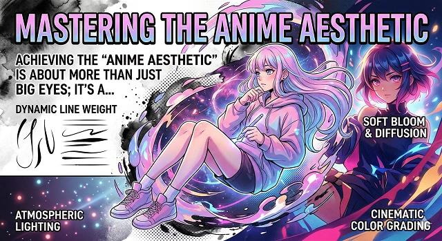
Mastering the Anime Aesthetic
How to get that hand-drawn, high-energy Japanese animation look every time.
The secret is in the "Cel-Shaded" prompt. Tell the AI you want "sharp ink outlines" and "flat color blocks." This stops the AI from trying to make things look 3D and keeps them looking like they were painted on a physical animation cel.
Absolutely. For that classic 90s look, add "VHS grain," "chromatic aberration," and "hand-painted backgrounds" to your prompt. It softens the edges and gives it that nostalgic, slightly blurry feel from the golden age.
For high-speed scenes, use words like "impact frames" or "speed lines." The AI will add those sharp, streaking lines that make a sword swing feel 10x more powerful and fast.
Prompt for "watercolor texture" and "Ghibli-esque clouds." The AI focuses on soft greens and bright blues that mimic the hand-painted scenery of legendary films.
Yes! Anime is often "choppier" on purpose. Prompt for "limited animation style" to get that specific rhythm where characters move slightly less, but every move they do make is much more expressive.
Use keywords like "bloom" or "backlit glow." Mentioning "particle effects" like "crackling blue electricity" tells the AI to add those glowing layers that make a character look like they’re charging up.
Prompt for "detailed ocular highlights" or "large expressive pupils." Add "shimmering tears" for sadness or a "sharp narrowed gaze" for an intense battle look.
Use "lens flares," "god rays," and "golden hour reflections." Focus on everyday objects, like "sunlight reflecting off a train window," to get that emotional, cinematic sparkle.
Line weight determines the thickness of outlines. For "Action Shonen," prompt for "thick, bold outlines." For "Slice of Life," ask for "thin, delicate line art."
Avoid a "plastic" look with keywords like "matte painting," "painterly textures," or "gouache style." This tells the AI to use visible brushstrokes and soft gradients.
Ready to try Hedra?
Transform your ideas into cinematic video in seconds.